I want to dive into something that a lot of museums, exhibitions, and cultural institutions struggle with: creating a seamless and effective ticketing experience online.
We’ve all been there. You hit a website to grab tickets, and you’re hit with three pop-ups, five unnecessary fields, and zero idea what you’re even buying. That’s a problem.
So let’s break down how we helped the Museum of the African Diaspora (MoAD) in San Francisco solve this exact issue with a ticketing page that’s simple, functional, and most importantly — converts.

The number one thing to keep in mind when designing a ticketing experience is this: keep it simple. Too many steps, hidden fees, or confusing layouts? People bounce.
For MoAD, we built the site in Webflow from top to bottom and integrated third-party ticketing software to streamline the checkout. Our goal was to make it ridiculously easy for someone to land on the site, click a few times, and walk away with their tickets in hand.
Here’s what that looks like in action:
That’s it. No fluff, no signup required, no guesswork.
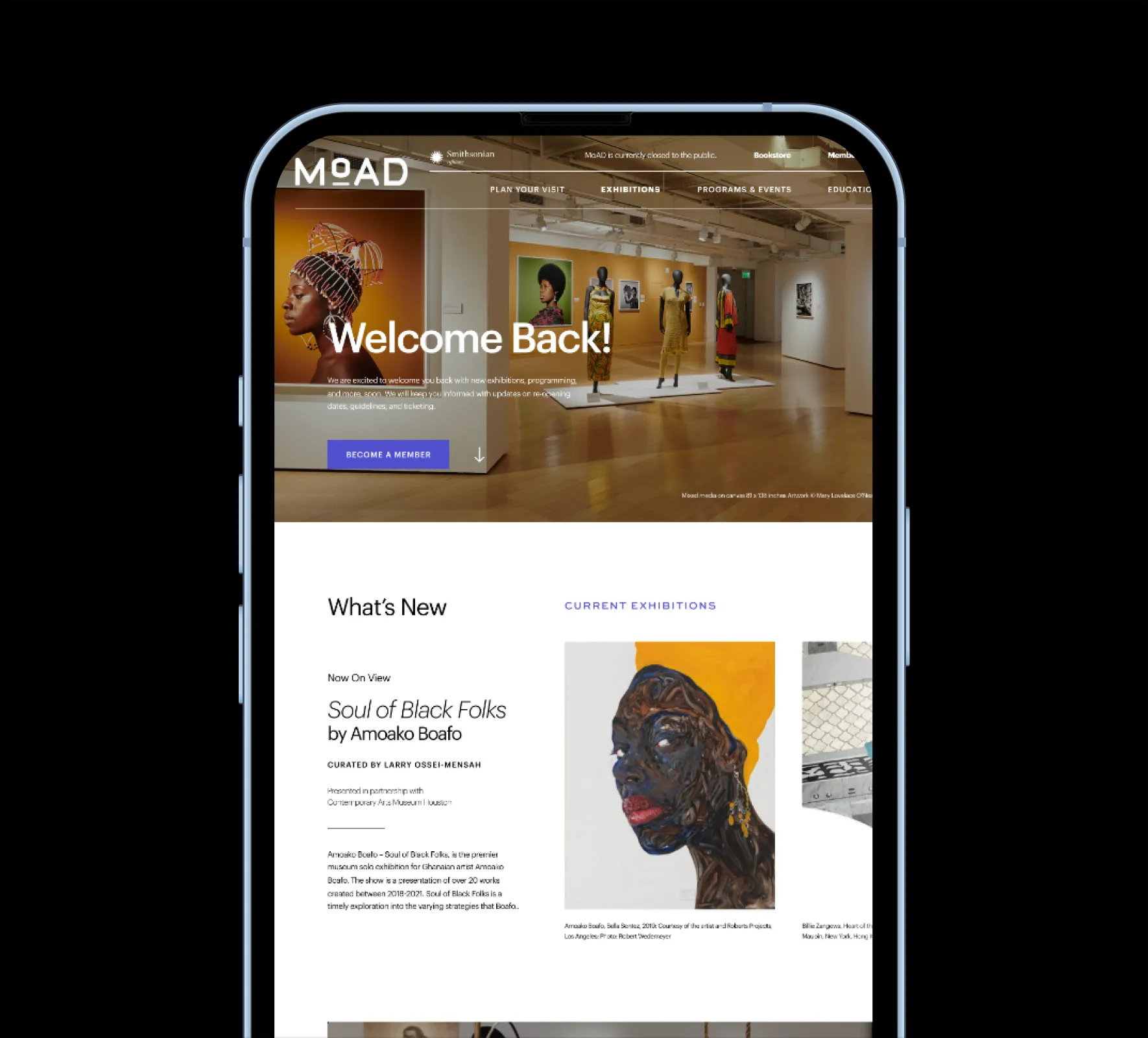
Right when someone lands on the homepage, they should know what your space is about and what they can do next. With MoAD, we used a looping background video — short and visually engaging — that gives a quick look into the museum and its vibe.
Above the fold, users can already take action: view events, learn more, or — yep — get tickets. They don’t even need to scroll.

We took a deep dive into UI/UX and made sure we focused on a few key elements that drive conversions:
It’s all about reducing friction — and the results show.
One of the worst things a ticketing page can do is surprise users with hidden fees or unclear pricing. That kills trust.
On the MoAD site, we show the total price up front — no games. Big, bold buttons lead you through the checkout. And just in case you’re wondering what’s coming up, we added an Exhibition Calendar that’s filtered by Past, Current, and Upcoming. Super clean, super easy to navigate.
And it’s all powered by Webflow CMS, so the content auto-updates based on the exhibit dates. No manual work. Just smooth automation.

Most people are hitting your site from their phone. So if it doesn’t load fast and look clean on mobile? You’re losing sales.
The mobile version of the MoAD site maintains that looping video and simplifies navigation with a drop-down menu. Everything’s left-aligned for accessibility, and form fields are optimized for thumb-friendly use.
With this new setup, here’s what we’ve seen:
Bottom line: a frictionless experience equals more sales and better customer satisfaction.
I hope this breakdown helped you think through your own ticketing flow — whether you’re working with a museum, a gallery, or any event-driven business.
Until next time — peace ✌🏾
Ready to collab? Let's chat!
The best source of information for customer services, sales tips, guides and industry best practices. Join us.
Not quite ready to schedule a call? Explore our free resources designed to help you elevate your digital presence. Simply enter your name and email to gain access to these valuable tools:

Present your educational initiatives with clarity and impact using our comprehensive Pitch Deck Template. This resource includes all the essential slides needed to captivate stakeholders and effectively communicate your vision.

Ensure a smooth and successful website launch with our detailed checklist. This essential guide walks you through every critical step, from pre-launch preparations to post-launch optimizations, tailored specifically for educational institutions.

Enhance your institution's online presence with our Optimization Guide. This resource provides actionable strategies and best practices to improve user engagement, streamline navigation, and drive results on your website's homepage.

Schedule a free call to explore how we can help you transform your brand and website.