In today’s video, I’m breaking down the exact criteria every single homepage needs to convert, get leads, and get that moolah. Let’s dive in!

So here’s the cheat code: a lot of web designers use this kind of layout structure for their website, and if you’re having trouble kind of getting a homepage layout or structure that you need, here’s what you need.
At the top of the page–most users are going to read left-to-right, so you’re going to have your logo in the upper left hand corner, you’re gonna have some kind of title or headline, a subtitle, a call-to-action, some social proof, and a visual.
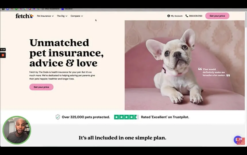
Now I’m gonna show you an example. This website is a phenomenal job. It’s called fetchpet.com, and they do insurance for doggies.

As you can see, this is the essential layout: logo in the top left, we have menu items here, we have the title and headline here, “Unmatched pet insurance advice & love,” boom! We know exactly what they do at the top level.
Then we have a subtitle, which kind of explains what they’re talking about in the tagline or main headline. We also have some type of call-to-action called, “Get your price.” We want to snag them and get them in there immediately.
So as you can see, Title-Headline, Title-Headline, Subtitle, Subtitle, and then CTA right here, then some type of social proof.
Sometimes you can’t put everything above the fold, so you can put them below. But as you can see, they’ve got Trustpilot integrated right here with some social proof from 325,000 people. By going to this page, right here above the fold, I get all the information I need to make an informed decision right now.
Next up, a visual. You can see that we’ve got a cute little pup here, with a little quote! Oh man, everything here is just perfectly executed on this site.

Below the fold, you wanna have features and objections. So right here we have some of the features. Included in that are some of the objections as well, and then we have How it works here also–so you can see, Features and Objections–and then more social proof. So we wanna scroll down, and you can see we have more social proof right here in the testimonial.

Then FAQs and benefits. As you can see here some of the benefits of where that money goes, as well as more benefits here, and then another social proof section here. So you get one, two, three sections to go ahead and make that informed decision.
Lastly, additional Call-to-Action. We usually wanna have that before the footer, as you can see we have “Get a free quote” right here. Then an About Us or a brief overview of the company as a whole, which you can see a little bit about here while you view the services they offer, and a little bit about how Fetch works.
As you can see, this homepage has executed this process perfectly–it’s a really simple layout, and I’ll share this Figma file with you in the description below. But ultimately, this is going to be everything you need on your homepage so that your user can make an informed decision on working with you.
Thank you, all, for checking out the content. As always, drop a Comment if you have questions, Like if you enjoyed the content, and Subscribe if you wanna see more content like this. I will see you all next week!
The best source of information for customer services, sales tips, guides and industry best practices. Join us.
Not quite ready to schedule a call? Explore our free resources designed to help you elevate your digital presence. Simply enter your name and email to gain access to these valuable tools:

Present your educational initiatives with clarity and impact using our comprehensive Pitch Deck Template. This resource includes all the essential slides needed to captivate stakeholders and effectively communicate your vision.

Ensure a smooth and successful website launch with our detailed checklist. This essential guide walks you through every critical step, from pre-launch preparations to post-launch optimizations, tailored specifically for educational institutions.

Enhance your institution's online presence with our Optimization Guide. This resource provides actionable strategies and best practices to improve user engagement, streamline navigation, and drive results on your website's homepage.

Schedule a free call to explore how we can help you transform your brand and website.